
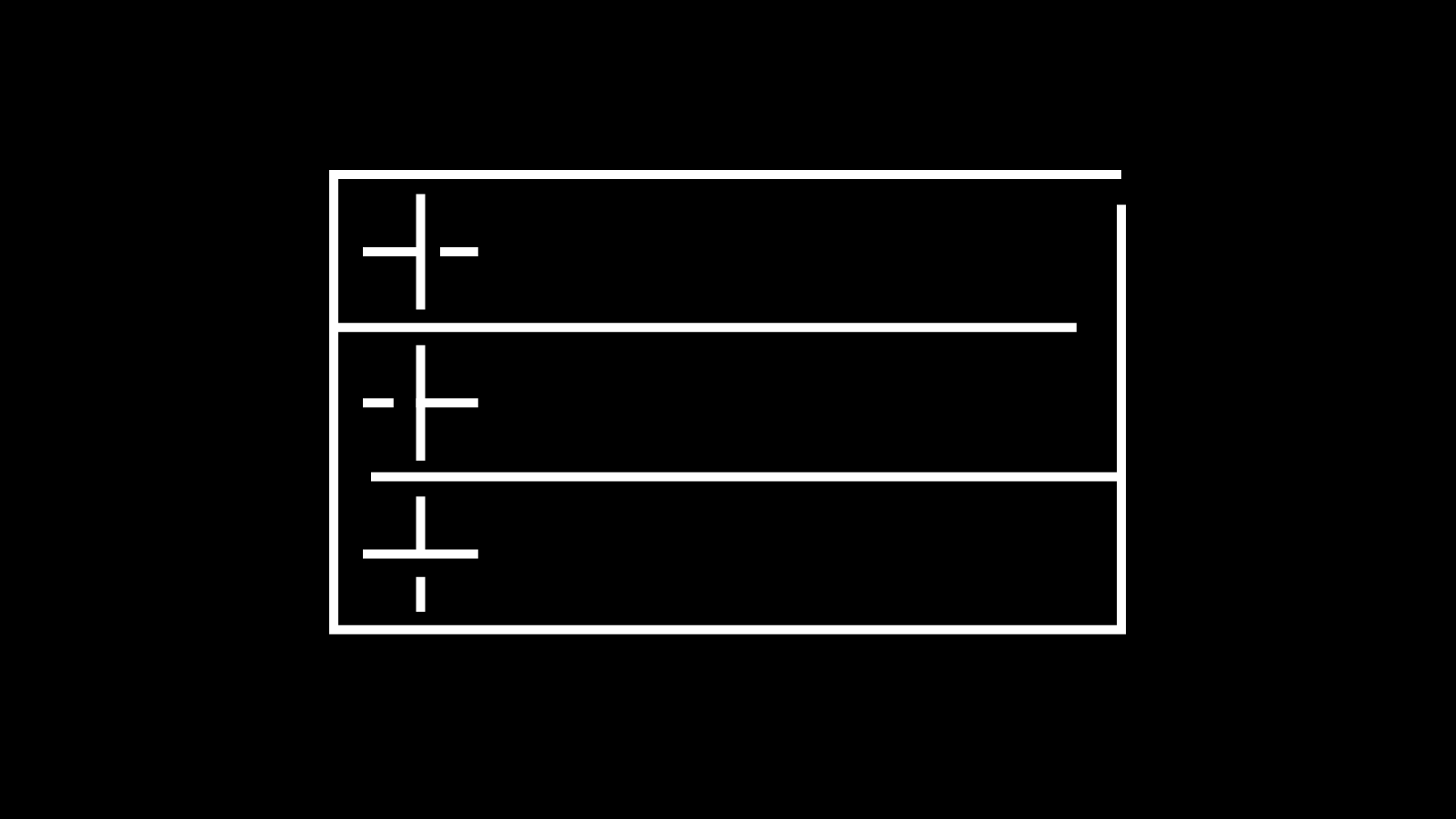
開閉アニメーション付きのアコーディオンをJavaScriptで作成
開閉アニメーション付きのアコーディオンをJavaScriptで作成する方法を紹介します。
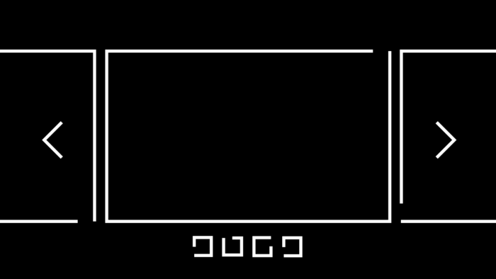
右端の矢印をクリックするとアコーディオンが開きます。もう一度矢印をクリックするか、CLOSEボタンをクリックすると、アコーディオンが閉じます。

右端の矢印をクリックするとアコーディオンが開く

もう一度矢印をクリックするか、CLOSEボタンをクリックすると、アコーディオンが閉じる
コード
<ul id="column1">
	<li class="textcontent">
		<li class="ac_title">タイトルタイトルタイトルタイトルタイトルタイトル</li>
		<li class="ac_text-container">
			<div class="ac_text" >
				<p>
					テキストテキストテキストテキストテキストテキストテキストテキストテキストテキストテキストテキストテキストテキストテキ
				</p>
				<div class="ac_text_close" >CLOSE</div>
			</div>
		</li>
	</li>
	<li class="textcontent">
		<li class="ac_title">タイトルタイトルタイトルタイトルタイトルタイトル</li>
		<li class="ac_text-container">
			<div class="ac_text" >
				<p>
					テキストテキストテキストテキストテキストテキストテキストテキストテキストテキストテキストテキストテキストテキストテキストテキストテキストテキストテキストテキストテキストテキストテキストテキストテキストテキストテキストテキ
				</p>
				<div class="ac_text_close" >CLOSE</div>
			</div>
		</li>
	</li>
</ul>
#column1 {
height: 100vh;
width: 100vw;
padding: 5em 10vw;
background-repeat: no-repeat;
background-position: 70% center;
background-size: cover;
position: relative;
}
li{
list-style: none;
}
.textcontent{
opacity: 0;
text-transform: uppercase;
text-align: left;
border-bottom: solid 2px #000;
}
.ac_title{
padding: 1em 0;
font-weight: 400;
border-bottom: solid 1px #fff;
cursor: pointer;
position: relative;
line-heigjt: 1;
padding-right: 60px;
margin-bottom: 1em;
}
.ac_title::before{
content: '';
position: absolute;
width: 15px;
height: 15px;
border-right: 2px solid #fff;
border-top: 2px solid #fff;
right: 1em;
top: 50%;
transform: translateY(-50%) rotate(135deg);
}
.ac_text-container{
overflow: hidden;
height:0;
}
.ac_text{
height:auto;
/*background: blue;*/
}
.ac_text_close{
font-weight: 400;
text-align: right;
padding: 0.5em;
cursor: pointer;
}
.ac_text_close::before{
content:'×';
width: 1em;
height: 1em;
font-size:1em;
}
.textcontent{
opacity: 0;
}
const acTitle = document.querySelectorAll('.ac_title');
const acCloseButtons = document.querySelectorAll('.ac_text_close');

acTitle.forEach((acTitles)=>{

acTitles.addEventListener('click', () => {
	const nextElementSibling = acTitles.nextElementSibling;
	const nextElementSiblingChild = nextElementSibling.firstElementChild;
	//const acCloseButton = nextElementSiblingChild.lastElementChild;
	const acTextHeight = nextElementSiblingChild.clientHeight;
	if(acTitles.classList.contains('open')){
		nextElementSibling.animate(
			{
				height: [`${acTextHeight}px`, 0]
			},
			{
				duration: 1000,
				easing: 'ease',
				fill: 'forwards',
			}
		);
		acTitles.classList.remove('open');
		//アロー
		acTitles.animate(
			{
				transform: ['translateY(-50%) rotate(-45deg)','translateY(-50%) rotate(135deg)']
			},
			{
				duration: 1000,
				easing: 'ease',
				fill: 'forwards',
				pseudoElement: "::before",
			}
		);
	}else{
		nextElementSibling.animate(
			{
				height: [0,`${acTextHeight}px`]
			},
			{
				duration: 1000,
				easing: 'ease',
				fill: 'forwards',
			}
		);
		nextElementSibling.animate(
			{
				height: ['auto']
			},
			{
				delay: 1000,
				duration: 0,
				easing: 'ease',
				fill: 'forwards',
			}
		);
		acTitles.classList.add('open');
		//アロー
		acTitles.animate(
			{
				transform: ['translateY(-50%) rotate(135deg)','translateY(-50%) rotate(-45deg)']
			},
			{
				duration: 1000,
				easing: 'ease',
				fill: 'forwards',
				pseudoElement: "::before",
			}
		);

	}
	});

});

acCloseButtons.forEach((acCloseButton)=> {
	acCloseButton.addEventListener('click', () => {
		const acCloseButtonP = acCloseButton.parentElement; //ac_text
		const acCloseButtonPP = acCloseButtonP.parentElement; //ac_text-container
		const acTextHeightClose = acCloseButtonP.clientHeight; //高さ
		const prevElementSibling = acCloseButtonPP.previousElementSibling; //ac_title
		acCloseButtonPP.animate(
			{
				height: [`${acTextHeightClose}px`, 0]
			},
			{
				duration: 1000,
				easing: 'ease',
				fill: 'forwards',
			}
		);
		prevElementSibling.classList.remove('open');
		//アロー
		prevElementSibling.animate(
			{
				transform: ['translateY(-50%) rotate(-45deg)','translateY(-50%) rotate(135deg)']
			},
			{
				duration: 1000,
				easing: 'ease',
				fill: 'forwards',
				pseudoElement: "::before",
			}
		);
	});
});