
Masonryで、Pinterestみたいなメイソンリーレイアウトのアーカイブを作成
以前のBLOGで、メイソンリーレイアウトのギャラリーを作成しました。今回は、Masonryで、Pinterestみたいなメイソンリーレイアウトのアーカイブを作成する方法を紹介します。

出典 : Masonry
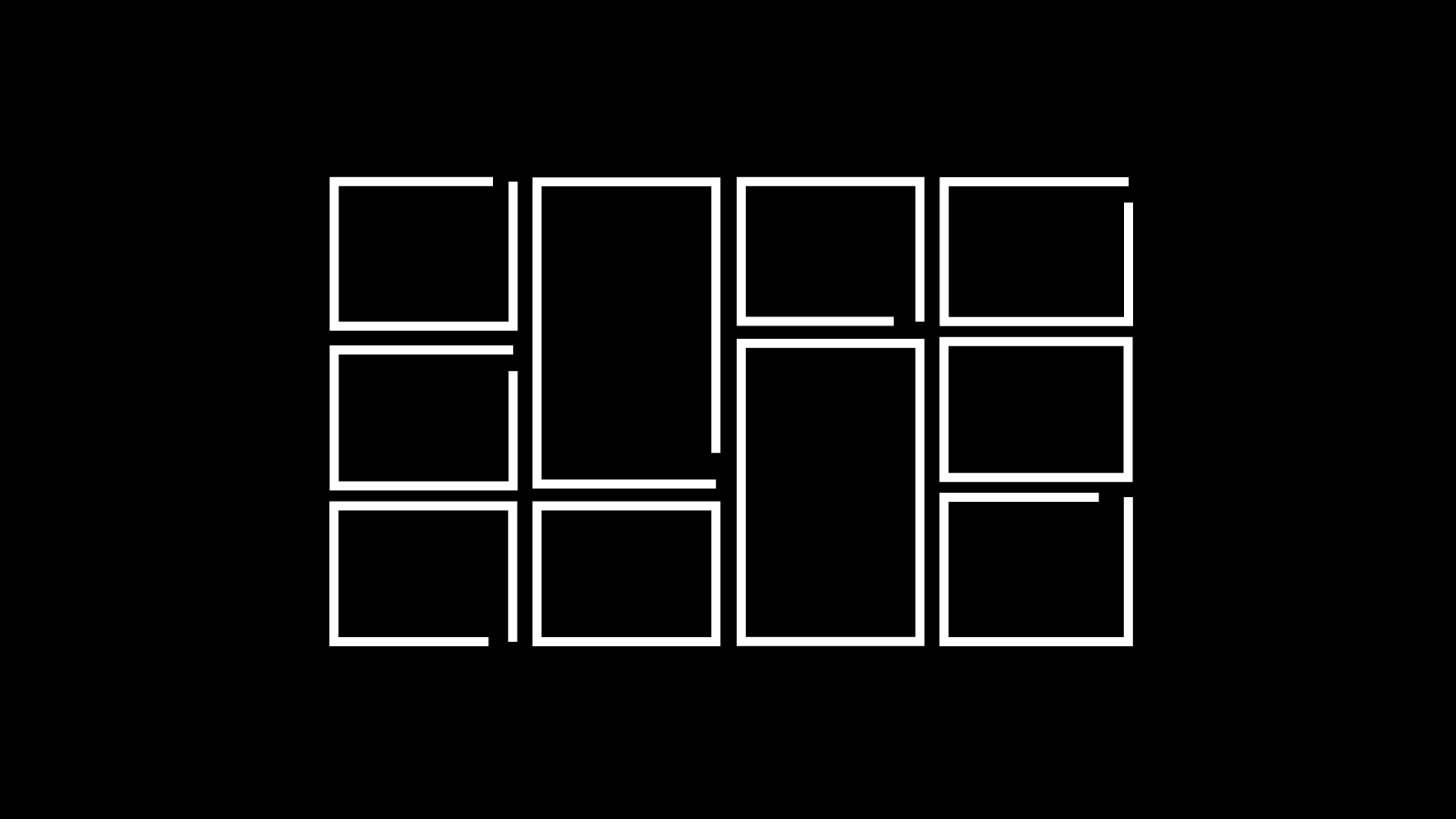
今回のDEMOは、NEWSのアーカイブです。

12個の投稿が表示されます。PCでは4カラム、タブレット、SPでは2カラムになっています。
コード
PHPの表示したい場所に下記コードを入力します。
<ul class="masonry">
	<?php
		$args = [
    		'category_name' => 'news',
			'numberposts' => 12
		];
	?>
	<?php
	// 条件を渡して記事を取得
		$custom_posts = get_posts($args);
	foreach ( $custom_posts as $post ): setup_postdata($post); ?>
		<li class="masonry-item">
			<article class="news">
				<div class="about-news-icon zoomIn">
					<a href="<?php echo esc_url(get_permalink()); ?>">
						<?php if(has_post_thumbnail()): ?>
                    		<?php the_post_thumbnail('medium_large'); ?>
                		<?php else: ?>
                			<img src="<?php echo esc_url(get_theme_file_uri('/assets/images/damy001.jpg')); ?>" alt="damy" >
            			<?php endif; ?>
					</a>
					<div class="post-category"><?php the_category(); ?></div>
				</div>
				<div class="masonry-article">
					<time class="time"><?php the_time( 'Y.m.d' ); ?></time>
					<a class="detail-link" href="<?php echo esc_url(get_permalink()); ?>">
              			<p class="title"><?php the_title(); ?></p>
              			<p class="news-text"><?php echo get_the_excerpt(); ?></p>
					</a>
				</div>
        	</article>
		</li>
	<?php endforeach; wp_reset_postdata(); ?>
</ul>jQueryを読み込みます。MasonryのJavaScriptをPHPに読み込みます
<script src="https://code.jquery.com/jquery-3.7.1.min.js" integrity="sha256-/JqT3SQfawRcv/BIHPThkBvs0OEvtFFmqPF/lYI/Cxo="crossorigin="anonymous"></script>
<script src="https://unpkg.com/masonry-layout@4/dist/masonry.pkgd.min.js"></script>JavaScriptファイルを作成し、下記コードを読み込みます。
$('.masonry').masonry({
  itemSelector: '.masonry-item',
  gutter: 0,
  percentPosition: true
});CSSでスタイルを整えます。
#masonrypost{
	padding: 3% 2% 3% 3%;
}

#masonrypost .masonry-item{
    width: 24%;
    margin-bottom: 1%;
}

#masonrypost .gallery li {
	margin-right: 1%;
}

#masonrypost .gallery li:nth-child(4) {
	margin-right: 0%;
}

@media(max-width:900px) {
    #masonrypost .masonry-item {
        width: 49%;
    }

	#masonrypost .gallery li:nth-child(2) {
	    margin-right: 0%;
	}
}
あとは、デザインに合わせて、投稿のスタイルを変更すれば完成です。
以上で今回の説明は終了です。Pinterestみたいにオシャレなレイアウトになりますね。CSSでいろいろ変更できるのでデザインの幅が広がります。